A while ago, Brian Auer posted a project on his blog where he invited people to use a photograph that he would supply and process it in Photoshop (or any other image editing software). The idea was to see how different people take an image and work on it.
Brian was kind enough to give us the option of starting from the original RAW file from his camera as long as we reminded ourselves time and time again that we did not own the photograph, but were only borrowing it for purposes of this project.
My Previsualisation Method
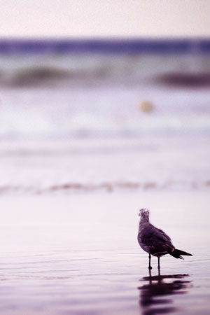
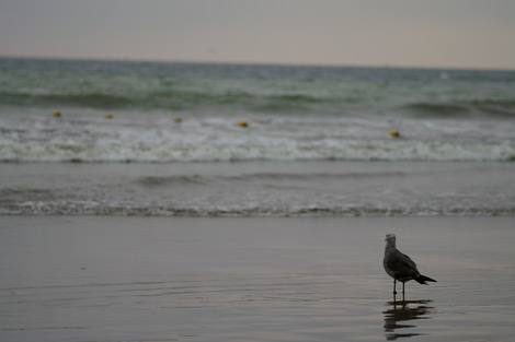
No two interpretations of this image are ever going to be exactly the same, and I decided to previsualize the end result of my edit before I even started the edit.
I was looking at creating an evening-ish look by enhancing the inherent magenta colour-cast in the image and giving it a hint of blue/green.
But the image was dull, and I didn’t want it starting off so dark.
I started by working on the image in Adobe Bridge, and Adobe Camera RAW (ACR) and correcting the tones, the slight tilt and the brightness. Personally, I felt that the image was rather under-exposed (though Brian thinks otherwise) so I brightened it up quite a bit.
Nothing was lost in terms of detail because I was editing the RAW file.
Beginning The Photo Edit
Starting off with the RAW processing, I increased the exposure by 1.6 stops and bumped up the vibrance by 23 points. At this point, I was playing around, and so I decided to try out the parametric tone curve option. I don’t remember what the default settings were, but in the end, highlights were at 60, lights were at -21 and shadows were at -73. What I was trying to achieve was some degree of detail in the bird’s body while keeping the whites-white and reducing the blacks in the image to the real shadows.
I played around with the saturation and luminance in the blue, green and aqua colour ranges, and bumped up the sharpening a bit (Brian’s image is focused on a point that’s slightly in front of the bird, so the bird was softer than it should be).
I ended up with this image.
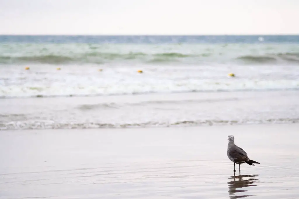
Do you think it’s a tad washed out? Yes, I’d agree with you on that.
However, this was just the first stage and had taken me only a minute or two of fiddling around…
It was time to open up the Grand-daddy program of image editing… Adobe Photoshop.
Beginning the Edit in Photoshop
I almost always start off my Photoshop edits by duplicating the background layer. The image, to me, is all about the bird and I thought that the waves were a bit too distracting. To sort this out, I decided to make the background softer.
Adding Lens Blur
Yup, Photography got a bit easier (or complicated, whatever…) Photoshop has a great filter called ‘Lens Blur’.
This filter mimics factors that only a lens can produce in low depth-of-field images such as ‘circles of confusion‘ and progressive blurriness.
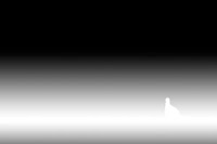
To help the filter, you need to create an Alpha Channel (tech jargon for ‘mask’). I entered the Quick Mask mode by pressing ‘Q’, set up a gradient that would represent the bird being the actual point of focus and the foreground and background going into black (blurriness).
I also painted white into the area where the bird was, to make sure that it remained entirely in focus. You see the mask that I used on the left…
Adding Adjustment Layers – Colour Adjustments
Then, it was a simple matter of using adjustment layers. I used 4 adjustment layers in all.


- Layer 1: Levels adjustment layer that moved the midpoint way to the right, increasing the dark tones, while retaining the whites. I used a layer mask with a similar gradient to the blurring mask so as to confine the darkening effect to the green and blue waves and to allow it to an extent in the foreground. This ensured that the bird remained un-darkened. You can see in this image that the mild inherent vignetting is enhanced. This is something that I wanted. I tend to like vignettes… So it was good to see this.
- Layer 2: Curves adjustment layer The next step was to lighten the area in the middle and to increase the contrast a bit. I did this by adding a curves adjustment layer. This layer increased the contrast, made the highlights blow out a bit, losing detail… However, the bird’s head retained all the detail that I wanted in it. You may not be able to see the difference in the images here, but rest assured that it’s there, and will make a difference when the image is printed on paper or viewed large. Do take my word on it… it comes with years of practice with kids books with ‘spot the difference’ puzzles.
- Colour Adjustment: This step was possibly the most significant one in the processing of this image. I’ve mentioned earlier that my intention was not to radically transform the image. Rather, it was to change the mood of the image. I wanted it to look like it was taken a short while after the sun had set (as it may actually have been). The image already had a slight magenta-ish cast and I enhanced this. I also increased the greens in the highlights and the lower mid-tones. I then lowered the overall brightness, making the shadows darker to a greater degree than the highlights. The colour-cast was not quite what I wanted it to be as yet.
- Layer 3: Photo Filter Adjustment Layer I knew what I wanted to do as the next step. I used a “photo filter” adjustment layer. I used an orange-tinted filter and reduced the density to 11% as I thought it was a bit too harsh at the default 25%. This more-or-less was the image that I wanted, but there was something missing. I put the image away for a while and came back to it after I’d worked a bit on my bread-earning job. I realised that what was missing was a real ‘photoshop’ vignette. Here was my chance to put in a vignette… a ‘real’ fake one…
- Vignette Layer: I usually don’t like harsh, fake vignettes, so I paint them in by hand. This image called for something else though… I was going to use a gradient and use the multiply layer blending mode when I came across Brian’s nifty trick to create vignettes. So I used it. All I wanted was a little bit of a vignette to make the right-hand side look like it had something of a vignette in it. So, those of you with a low contrast setting on your monitors may not actually see the difference. You may want to turn up the contrast levels…
- Final Crop: But there was something missing. Looking at it for a while, it struck me that the actual subject was way too small in the frame and that all this while, I was trying to retain detail in the bird because I wanted to see it in some depth when displaying it. So, what I needed was a crop. I cropped the frame at the same aspect ratio but tried to keep the bird so that it filled at least one-ninth of the frame. I’d have cropped it closer from the top left, but the horizon line was a bit too close to the top of the frame for me to be comfortable with that… So I kept some of the beautiful vignetting that I wanted, and cropped it as you see it now. Now, the left of the frame was light, with a strong shape almost at a third of the frame. There was sufficient detail in the bird and in the sand in the foreground.
- That’s it… I was done…
Don’t forget to head over to Brian Auer’s Epic Edits Weblog to see what other people have done for this project; Edit My Photo.
If you enjoyed this step-by-step break-up of photoshop processing and the reasons for each of the steps, do let me know in the comments. I’ll make it a point to show you some of the processing behind some of my images.
What did you think of my edit? Did you like it? Hate it? Leave a comment below and let me know either way.
Though this project is from 2007, the thinking, and most of the steps remain more or less exactly the same and will probably still be applicable for the next decade or more.
Help Us To Continue Creating
Get our email newsletter to stay up-to-date with our latest posts. It’s easy to read and is mailed once in 2 weeks.
The easiest way to support Beyond Photo Tips is by using our affiliate links when you buy anything at all. It will never cost you anything extra, and we get a small commission from it, which helps us a LOT! We share our recommended equipment list here.
Some of the links to products on this website are affiliate links, and we only ever link out to gear that we recommend.
You could also show your appreciation by buying us a coffee. Finally, we appreciate you being a part of the community, so do say hi!

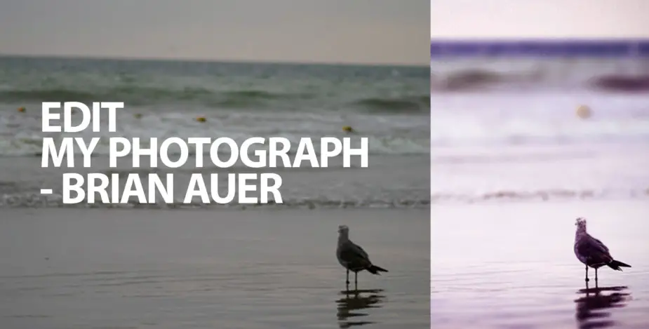



Dude — you rock! That’s quite a write-up you’ve done to go along with the photo. Great results on the image — the color, the exposure, the DOF, the vignette, the crop… all really good improvements! The thing that sticks out at me most of all is your method for adding blur. Now that you mention it, I’ve seen this done before, but I’ve never applied it myself. That adjustment alone would make for a great tutorial. Thanks for spending some time on this, it’s a great addition to the project.
Hey Brian,
I’m glad you like it. This project of yours is a good way to go… I’m already looking forward to the next one.
Cheers!
Susheel rocks. I had a look at Brian’s results page and i think your version is the best till now.
Your explanation of how did the edit is also awesome. Great work.
Your blog is nice. I think you should add your blog at http://www.blogadda.com and let more people discover your blog. It’s a great place for Indian bloggers to be in and I am sure it would do wonders for your blog.